
Workplace Solutions
Workplace Solutions
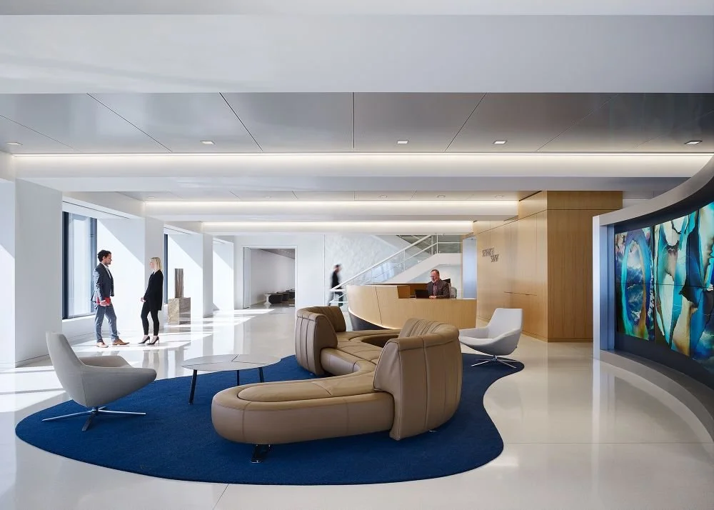
We had the pleasure of collaborating with Workplace Solutions, a leader in commercial interiors, known for creating design-driven work environments. Our mission was to enhance their brand presence and communicate the value they bring to their clients through strategic and visually compelling content. Our partnership with WPS was focused on enhancing their brand, improving their digital presence, and creating content that resonates with their audience. The work we did together has positioned WPS as a leader in their field, with a strong, cohesive brand that stands out in the competitive commercial interiors market.
logo & Tagline
Our logo redesign for Workplace Solutions was a pivotal step in transforming their brand identity. The original logo was wide, short, and squished together, making it difficult to read and low in contrast, which significantly affected its visibility, especially across digital platforms.
We reimagined the logo into a bold brandmark that enhances readability and visual impact. The new design was carefully crafted to improve visibility across all mediums, particularly through their expanding social media outlets. By increasing the contrast, refining the proportions, and creating a more balanced composition, we ensured that the logo stands out, whether it’s on a business card or a social media profile.
The result is a modern, striking logo that not only reflects the innovative spirit of Workplace Solutions but also enhances their brand recognition and presence in the competitive commercial interiors market. This redesign marks a significant improvement in how the company presents itself, helping them to connect more effectively with their audience online and offline.
color pallete
In our branding work with Workplace Solutions, selecting a diverse array of brand colors was a strategic decision designed to enhance both the visual identity and functionality of their proposals. Each product category offered by Workplace Solutions was assigned a distinct color, creating a visual guide that significantly improved wayfinding within their complex proposals. This approach made it easier for clients to understand where they were in the process, enabling them to navigate the information with clarity and confidence.
The introduction of these vibrant colors added a modern and bold dimension to the Workplace Solutions brand, infusing it with energy and making it more visually engaging. These colors weren’t just chosen for their aesthetic appeal; they were also carefully selected to align with the most popular textiles and design trends at Teknion, their key partner company. This alignment not only reinforced the connection between Workplace Solutions and Teknion but also ensured that the brand resonated with clients who appreciate the latest in design and materials.
By integrating these colors, we enhanced the overall brand package, making it more dynamic and ensuring it stays relevant in the ever-evolving commercial interiors industry. This thoughtful use of color has strengthened Workplace Solutions' brand identity, helping them to stand out and be instantly recognizable in a competitive market.
iconography
When selecting the graphics and iconography for Workplace Solutions, the goal was to create visuals that not only complement the brand's bold identity but also enhance the overall communication of the company's message. With the distinctive red and grey logo theme as a foundation, we chose to emphasize these colors throughout the graphics, ensuring that the brand's visual identity is consistent and immediately recognizable across all platforms.
To convey a sense of education and importance, we opted for bold, full-flat graphics. These designs were intentionally chosen for their clarity and readability, making them easy to understand at a glance. The simplicity of the flat design ensures that each graphic effectively communicates the meaning behind the accompanying text, without overwhelming the viewer or distracting from the core message.
Given that furniture and office design are central to Workplace Solutions' offerings, we were careful not to overshadow these key visual elements. To maintain focus on the imagery that tells the story of Workplace Solutions' expertise in creating functional and aesthetically pleasing workspaces, we kept the graphics minimal. This approach allows the photographs of furniture and office designs to capture the audience's attention while the supporting graphics subtly reinforce the narrative.
By scaling back the complexity of the graphics and focusing on minimalism, we achieved a balance that highlights the company's design prowess without diverting attention from the products and services at the heart of their business. The result is a cohesive visual identity that aligns with Workplace Solutions' brand values, enhancing both their internal and external communications.
brand messaging
Creating the brand messaging for Workplace Solutions (WPS) was a comprehensive and thoughtful process that aimed to capture the essence of what makes WPS a leader in the commercial interiors industry. We began by diving deep into the company’s rich history, which dates back to 1993 when WPS was established as a full-service contract furniture dealership. Our goal was to convey WPS's long-standing commitment to providing quality products and unsurpassed customer service—a commitment that has helped them build strong, long-term relationships with their clients.
To achieve this, we focused on highlighting key aspects of WPS’s operations. We emphasized their dedication to meeting not only the immediate needs of their clients but also anticipating future requirements—sometimes even those not yet defined. We wanted to underscore the unique combination of experience, innovation, and forward-thinking that WPS brings to every project.
Through in-depth interviews with team members from all departments—Account Managers, Designers, Customer Service Representatives, and Project Managers—we gathered insights that informed the messaging. We distilled their collective expertise into clear, impactful statements that communicate WPS’s strengths, such as their ability to deliver on-time, complete installations, and their reputation as one of the largest Teknion dealers in the U.S.
We also focused on WPS’s extensive service offerings, from design and project management to move coordination and furniture installation. The messaging needed to reflect their capability to handle complex, large-scale projects while maintaining a personal touch, ensuring that every client receives professional service tailored to their specific needs.
An important part of the brand messaging was also to showcase WPS’s strong relationships with key partners, like Teknion, and their ability to leverage these partnerships to offer competitive pricing and terms. We wanted to communicate that WPS isn’t just a provider of products and services but a trusted partner that clients can rely on for comprehensive workspace solutions.
Lastly, we included a narrative about the company’s core values—teamwork, innovation, and a client-first approach—demonstrating how these principles guide every aspect of their work. The resulting brand messaging not only positions WPS as a leader in the industry but also as a company deeply committed to creating workplaces that truly work for their clients. This messaging has become a cornerstone of their communications, helping WPS convey their unique value proposition to both existing and potential clients.
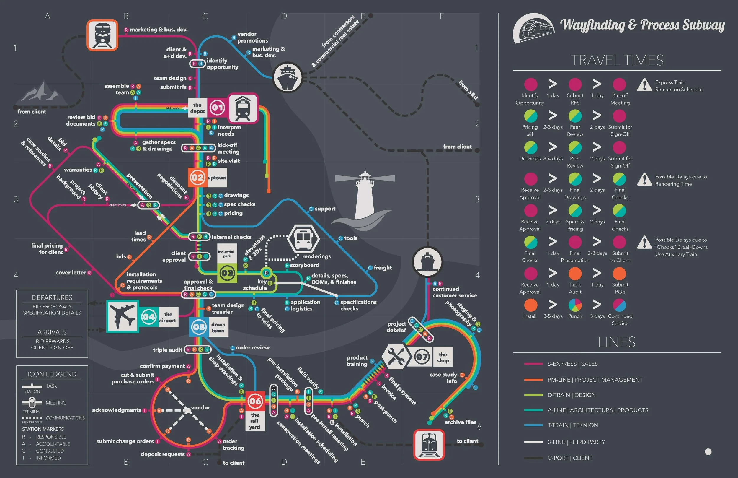
PROCESS MAPPING
Working with Workplace Solutions to generate a comprehensive process map was an in-depth and collaborative endeavor, designed to enhance both internal efficiency and client communication. The goal was to create a clear and detailed representation of the furniture ordering process, from start to finish, that could serve as both an internal reference and a client-facing communication tool.
The process began with a series of interviews across all departments. I met with team members from every area—sales, design, project management, logistics, and customer service—to understand their specific roles, timelines, responsibilities, and the forms and documents they use. This allowed me to compile a thorough list of each step involved in the process, noting where departments overlapped and where their workflows diverged.
With this information in hand, I outlined the various routes each process could take, accounting for variables that might alter the standard workflow. To ensure clarity and accountability, I employed the RACI (Responsible, Accountable, Consulted, Informed) framework to designate specific responsibilities across all tasks. This helped to clearly define who was responsible for each step, who needed to be consulted or informed, and who was ultimately accountable for the completion of each task.
Once the workflow was fully mapped out, I created a graphic representation of the process. This visual tool was initially intended for inclusion in the employee handbook, providing a reference that staff could use to understand the overall process and their role within it. However, recognizing its potential value beyond internal use, I proposed making this process map a client-facing document as well.
WPS loved the idea of using the process map as a marketing touchpoint. It became a powerful tool for the sales team to showcase the complexity of the furniture ordering process, the meticulous care and support provided throughout, and the reasons behind the timelines involved. By making the process transparent and accessible to clients, we not only enhanced client understanding but also built trust and confidence in WPS' dedication to delivering quality service.
This process map now serves a dual purpose: internally, as a key reference for employees, and externally, as a communication tool that helps clients appreciate the thoroughness and expertise that goes into every project.
01
02
04
branding
03
graphics
copy writing

CONSULTING
Industry
Contract Furniture
Services
Branding
Graphics
Messaging
Consulting