Viveroo USA
Viveroo USA
We had the exciting opportunity to partner with ViverooUSA, a dynamic and forward-thinking company renowned for its high-quality, design and lifestyle products. Our mission was to seamlessly blend Viveroo's established German design ethos with a futuristic flair tailored for the US market. We crafted a cohesive brand identity that resonated with American audiences while preserving Viveroo's core values. Our photography captured the essence of their sophisticated products, showcasing their elegance and functionality. Through intuitive web design, we created an engaging online platform that highlighted Viveroo's innovative solutions for the smart building and smart home markets. Our print media efforts also ensured consistent and impactful messaging across all channels. Our collaboration exemplified the perfect fusion of European precision and American creativity, driving ViverooUSA's mission to enhance lifestyles with cutting-edge design and technology.
logo
Creating the logo for ViverooUSA was a unique challenge that required us to carefully balance brand consistency with a fresh, localized twist. Our primary task was to craft a typeface that seamlessly matched the existing German counterpart, ensuring brand cohesion across international markets.
In addition to aligning the typography, we focused on amplifying the use of Viveroo’s iconic orange. This vibrant color not only reinforces brand recognition but also injects energy and modernity into the ViverooUSA identity. By enhancing the orange accents, we ensured that the logo stands out in the competitive market, symbolizing innovation and dynamic design while staying true to Viveroo’s established global presence. The result is a logo that honors its roots while boldly asserting its place in the U.S. market.
iconography
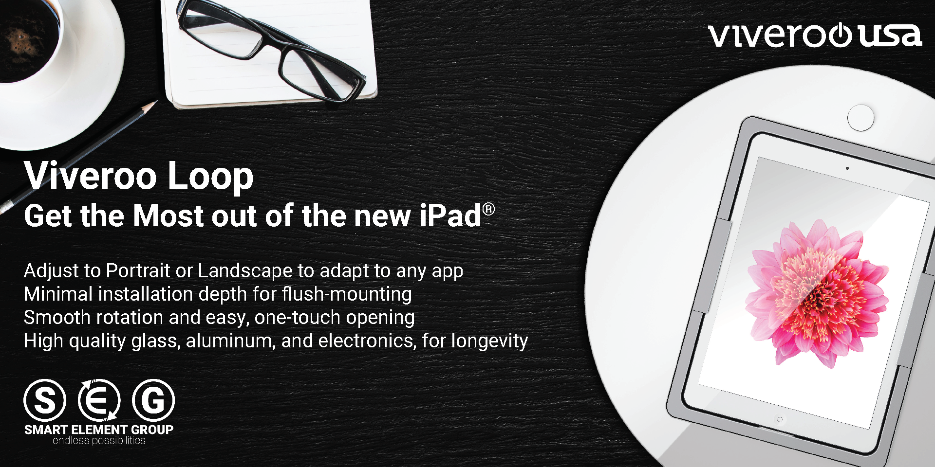
The graphics and imagery for ViverooUSA were meticulously designed to reflect the technology-forward ethos and clean aesthetics synonymous with the iPad and Apple products that Viveroo is built to protect. We drew inspiration from the sleek, minimalist design language of Apple, ensuring that every visual element exudes sophistication and innovation.
Our imagery highlights the seamless integration of Viveroo products with Apple devices, emphasizing their function as both a protective solution and a design-enhancing accessory. By using clean lines, modern compositions, and a refined color palette, we created visuals that not only resonate with tech-savvy consumers but also reinforce ViverooUSA’s commitment to quality and elegance. The result is a cohesive visual identity that aligns perfectly with the cutting-edge technology and stylish design of the products it represents.
brand messaging
Translating and generating brand messaging for ViverooUSA was a nuanced process that required more than just language conversion; it involved adapting the core values and messaging of the main German brand to resonate with an American audience. Our focus was on maintaining the integrity of Viveroo’s well-established brand identity while making it relevant and compelling for the U.S. market.
We carefully analyzed the German messaging, identifying key themes of innovation, quality, and design excellence. These themes were then translated into a tone and style that would appeal to American consumers, emphasizing the sleek, modern aesthetics and cutting-edge technology that Viveroo products offer.
We tailored the messaging to highlight the convenience, functionality, and premium quality of Viveroo’s solutions, aligning with the expectations and preferences of the U.S. audience. By doing so, we ensured that the American brand voice retained the sophistication and innovation of its German counterpart while being accessible and engaging for a new market. This approach allowed us to create a cohesive brand narrative that bridges cultures, delivering Viveroo’s message of excellence and innovation across borders.
website
Designing and executing the ViverooUSA website was a multifaceted project that required a careful balance between consistency with the existing German website and creating a unique identity for the U.S. market. Our goal was to build a site that not only matched the sleek, technology-forward design of its counterpart but also stood out with features tailored to the American audience.
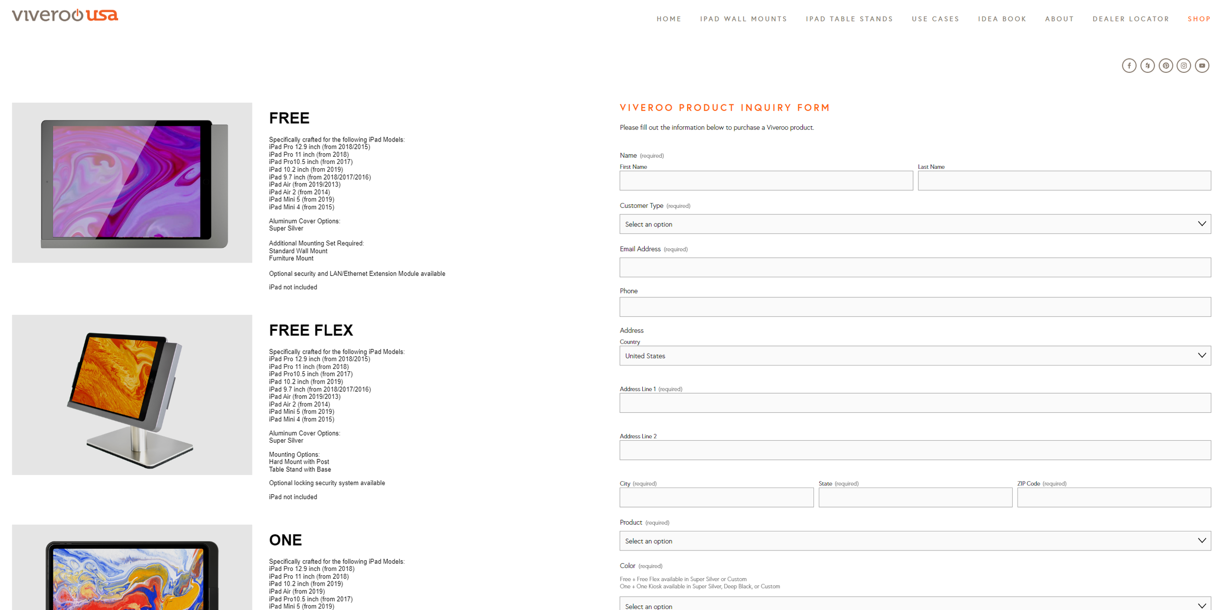
One of the key challenges we faced was developing an e-commerce store that could handle the extensive customization options for each Viveroo product. We worked diligently to create a user-friendly interface that allows customers to easily navigate through the various choices, ensuring a seamless shopping experience. The result is a dynamic and flexible e-commerce solution that meets the needs of a diverse customer base.
In addition to the online store, we implemented a dealer locator function, enabling users to find authorized dealers quickly and efficiently. This feature was designed to enhance user experience by providing easy access to local sales channels, supporting ViverooUSA’s growth across the country.
To further support customers and dealers, we integrated navigable brochures and comprehensive technical information throughout the site. These resources were carefully organized to be easily accessible, helping users make informed decisions about their purchases.
Overall, the ViverooUSA website is a testament to our commitment to delivering a visually cohesive and highly functional platform. It mirrors the clean, modern design of the German site while offering distinctive features that cater to the unique demands of the U.S. market, ensuring that ViverooUSA remains at the forefront of innovation and customer service.
PRODUCT BROCHURE
Designing the brochure for ViverooUSA was an exciting and comprehensive project that went beyond creating a simple standalone piece. Our goal was to seamlessly blend the branding across multiple deliverables, ensuring a cohesive and unified feel throughout all of the company’s communications. From the brochure to the website, and even down to the smallest collateral, we focused on maintaining a consistent visual language that truly embodies the Viveroo brand.
We crafted a visually compelling brochure that showcases the sleek, modern design and functionality of Viveroo products. To enhance the experience, we incorporated beautiful imagery that captures the elegance and sophistication of the brand, carefully selected fonts that complement the minimalist aesthetics, and a color palette chosen to evoke a sense of technological prowess and innovation. These elements work in harmony to highlight the premium quality and cutting-edge design that Viveroo is known for.
One of the key features of the brochure is the integration of QR codes, strategically placed to provide instant access to product details, website links, technical specifications, and pricing information. This modern touch bridges the gap between the physical brochure and the digital world, offering users a seamless and interactive experience. The flippable online version of the brochure further extends this cohesive branding, replicating the tactile feeling of flipping through a physical document while offering the convenience of accessibility from any device.
By combining these visual and interactive elements, we created a marketing suite that not only communicates the core values of ViverooUSA but also delivers a polished and consistent brand experience across all platforms. This approach ensures that every touchpoint with the customer reflects the brand’s commitment to excellence, innovation, and style, making the ViverooUSA brochure a powerful tool in showcasing the brand’s forward-thinking identity and user-friendly design.
01

02

04
05
branding
03
graphics
copy writing
web design
print media

Industry
Technology Products
Services
Branding
Graphics
Web Design
Brochures
Social Media

